Eiger Trading
Eiger is a UK-based asset-trading advisory firm specialising in delivering technology-driven solutions to the Islamic Finance sector. Despite its long-standing presence in the industry, Eiger was unable to create memorable impressions through its touchpoints to convey the brand’s vision, mission and offerings. Hence, they approached us for a rebranding exercise.
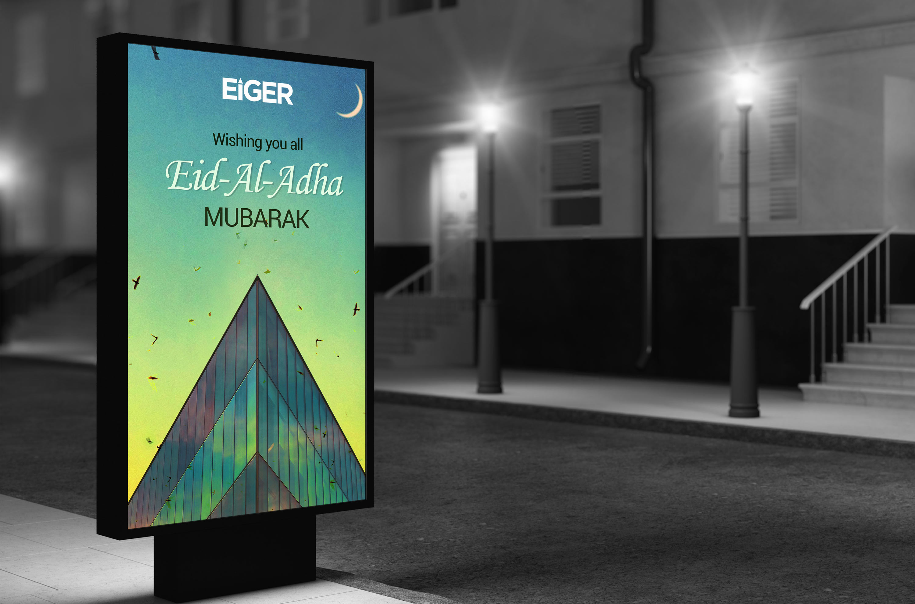
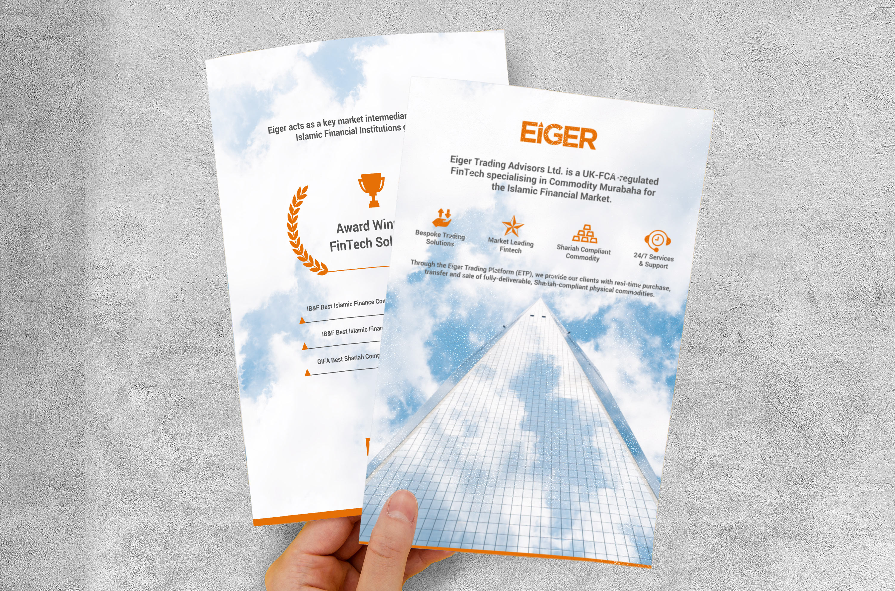
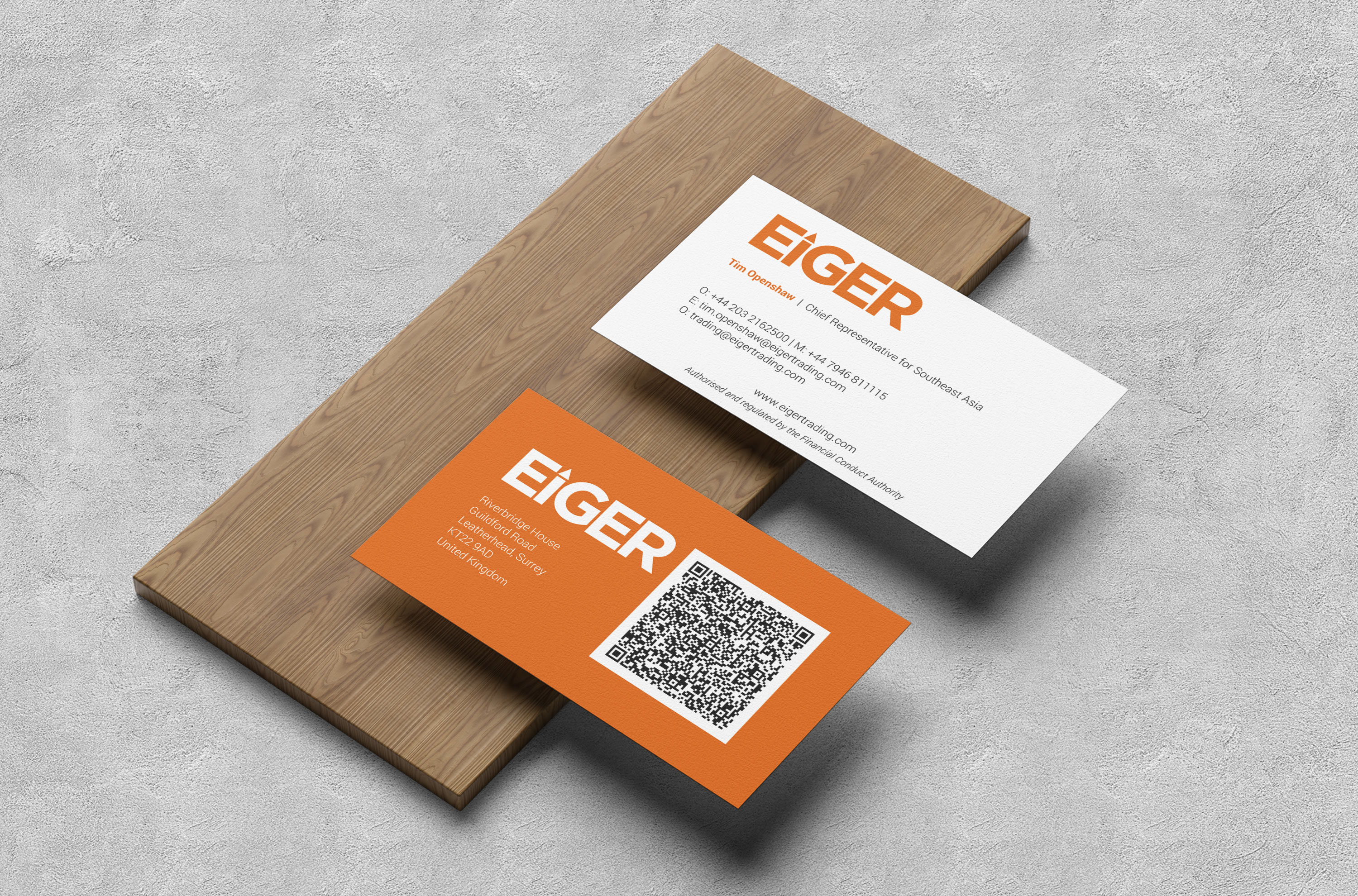
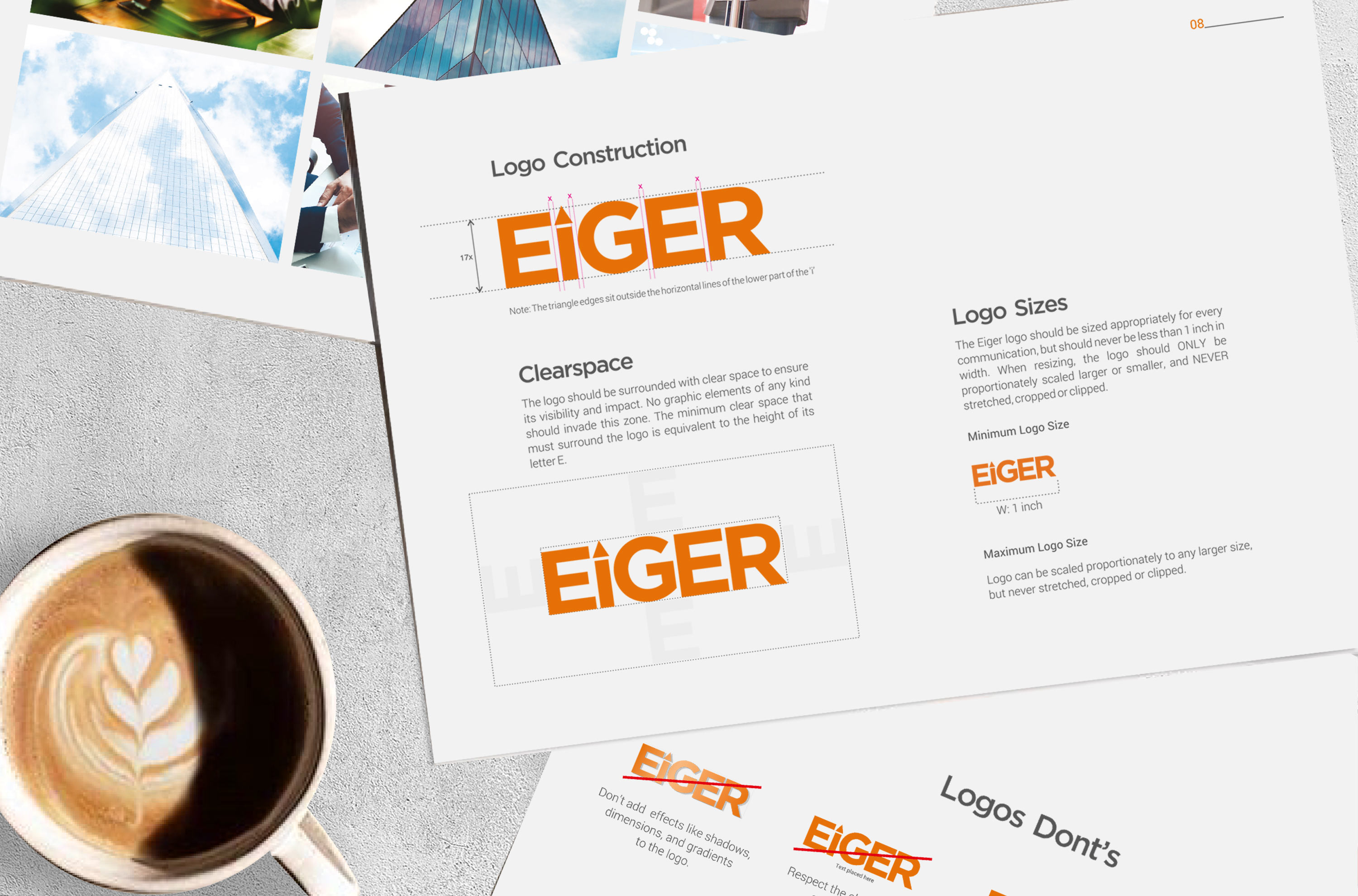
We conceptualised a minimalist yet an impactful type-based logo using a bright shade of orange for the brand. The bold font along with the bright colour ensured that the logo was well-perceived across online and offline touchpoints. To encapsulate Eiger’s vision of creating growth opportunities for its clientele in its name, we placed a ‘triangle’, pointing upwards, on the alphabet ‘I’. We also redesigned all branding and marketing collaterals for Eiger for promotional purposes and industry events. These collaterals were in consonance with the brand’s visual language.
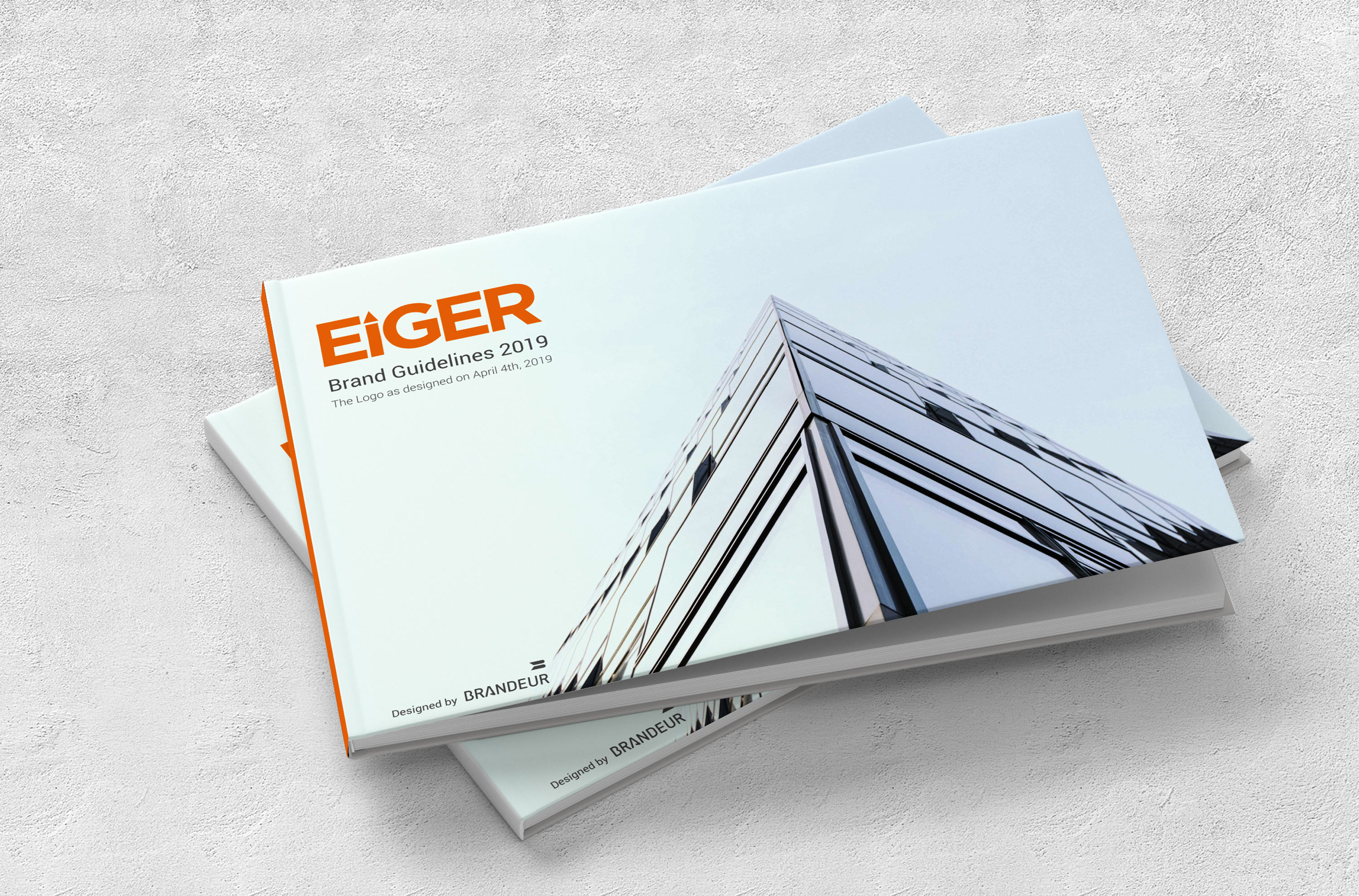
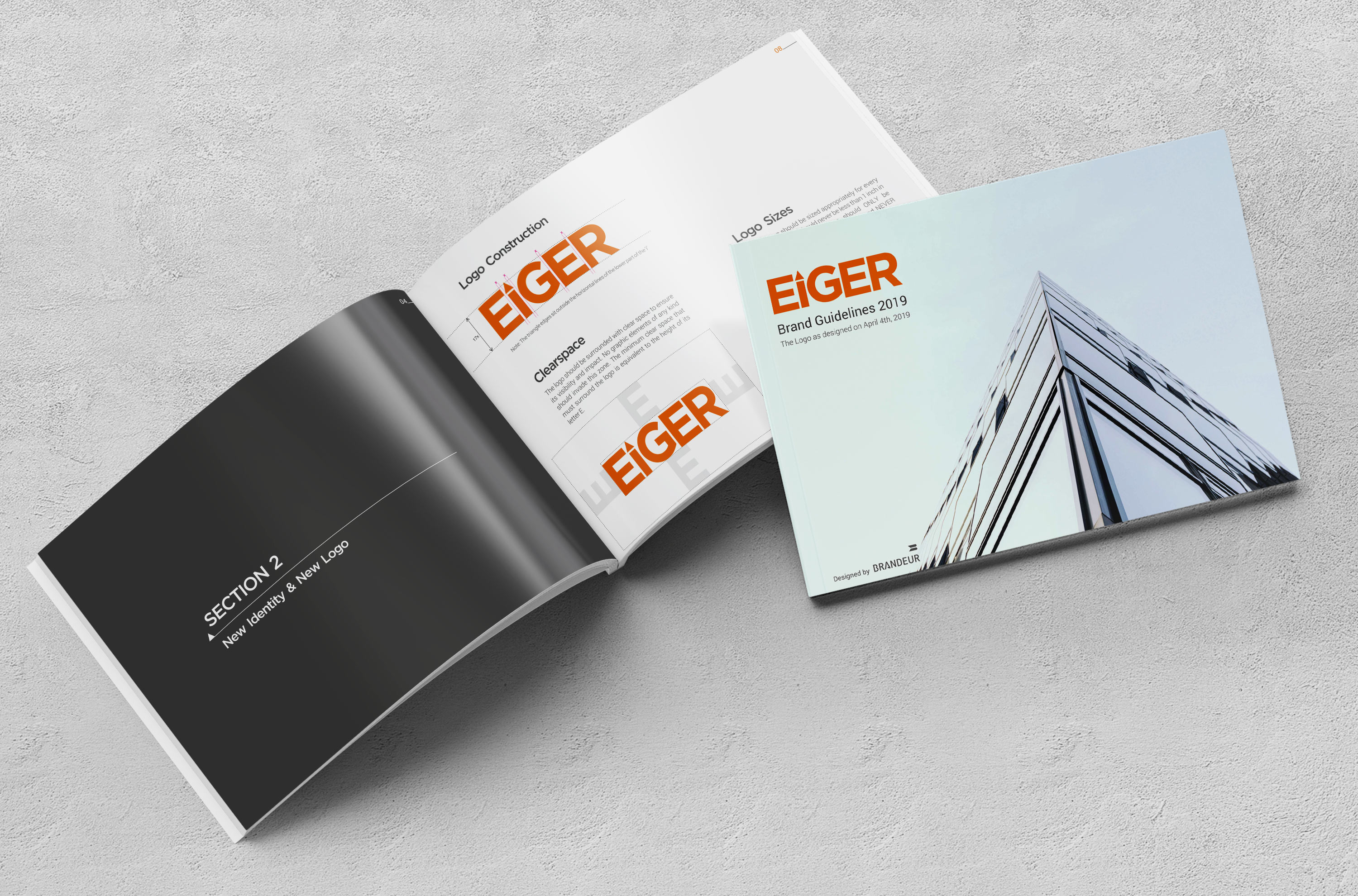
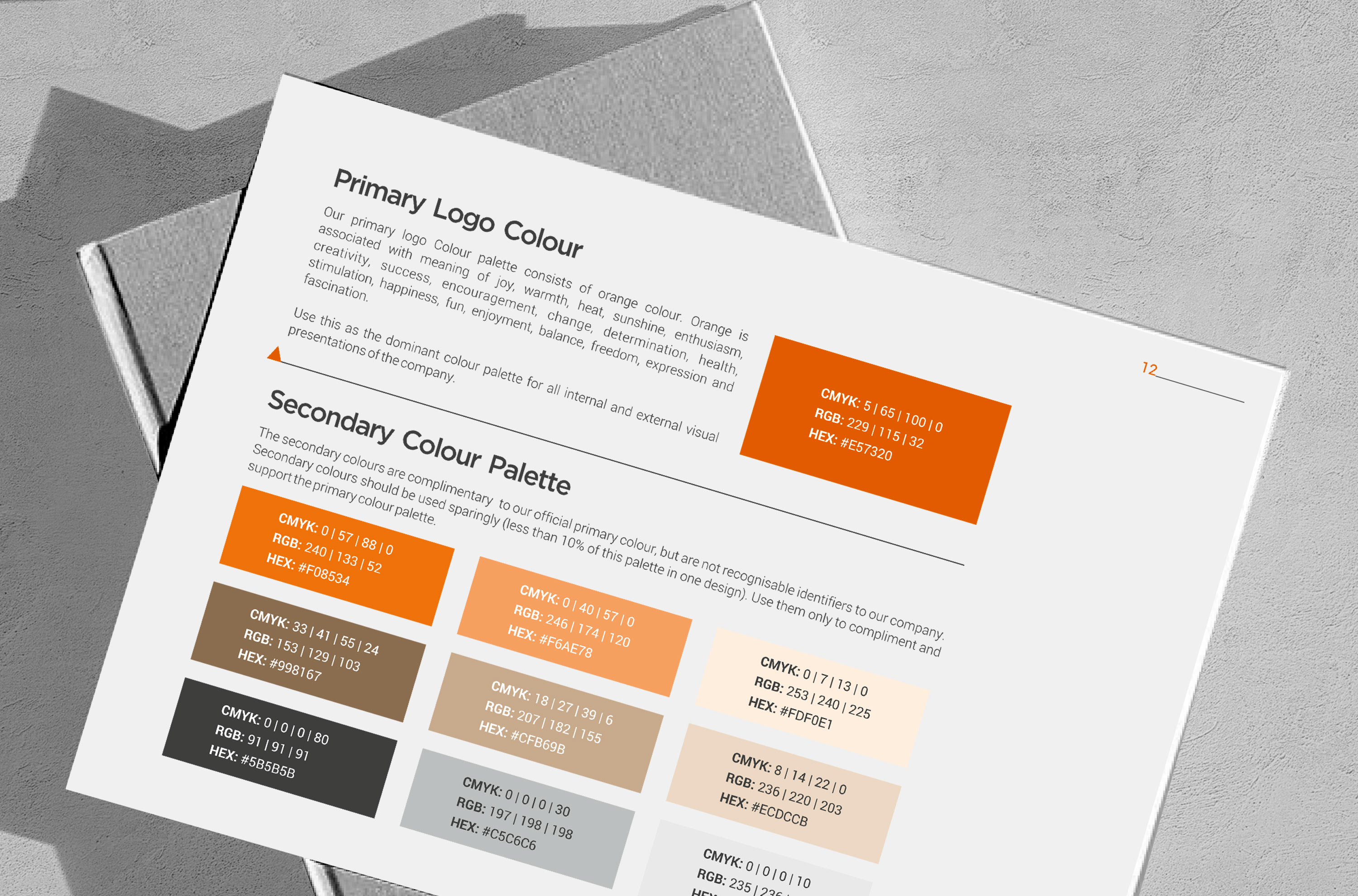
As part of the rebranding project for Eiger, the primary objective was to create ‘Brand Guidelines’ that allowed the brand to express itself in a consistent, assertive, and creative manner. For this, we extensively studied their industry’s nuances and competition, and based on our research, established the brand’s visual language along with the company’s style of voice, tone, and messaging.
With the established ‘Brand Guidelines’, Eiger can now effectively manage its marketing engagements and branding touchpoints while remaining coherent. The rebranding process also helped Eiger achieve a consistent and aesthetic visual design language that was in sync with the ethos of its business and let the brand communicate its unique propositions to its audience in a creative way.
