
OTLO
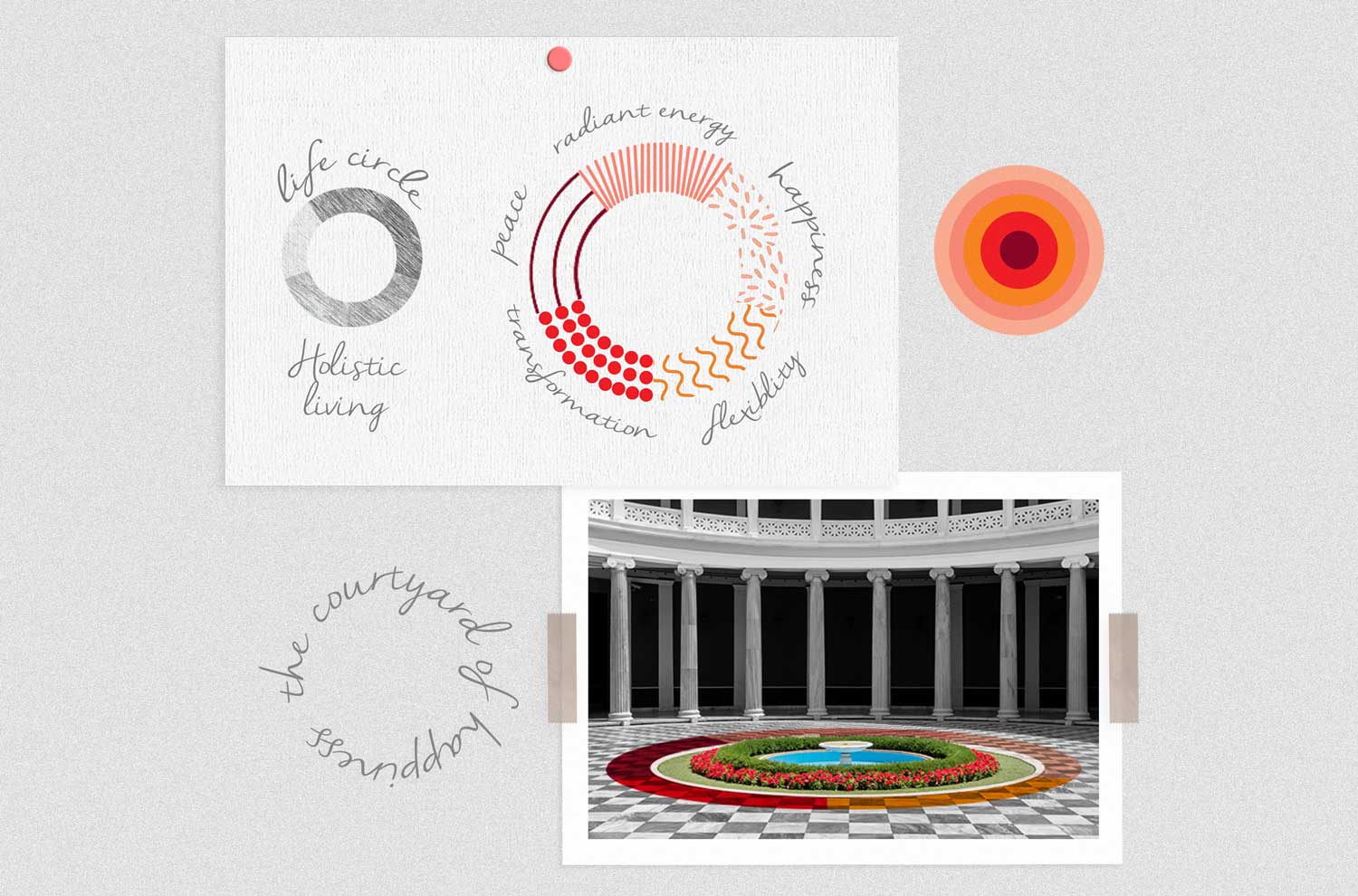
OTLO is a family-centric platform that strived to promote holistic living by helping families bond over conversations & health. Since OTLO literally means a ‘courtyard’ in Gujarati dialect, our objective while designing the logo was to capture the wholeness and the mystical positivity of a charming courtyard.
When the team reached out to us, we resonated with their idea and concept instantly. To encapsulate OTLO’s all-round approach towards one’s well-being, we created, what we call, ‘the circle of essence’, where each part of the circle uses a unique colour to communicate the values that OTLO strives to instill through its therapeutic sessions.
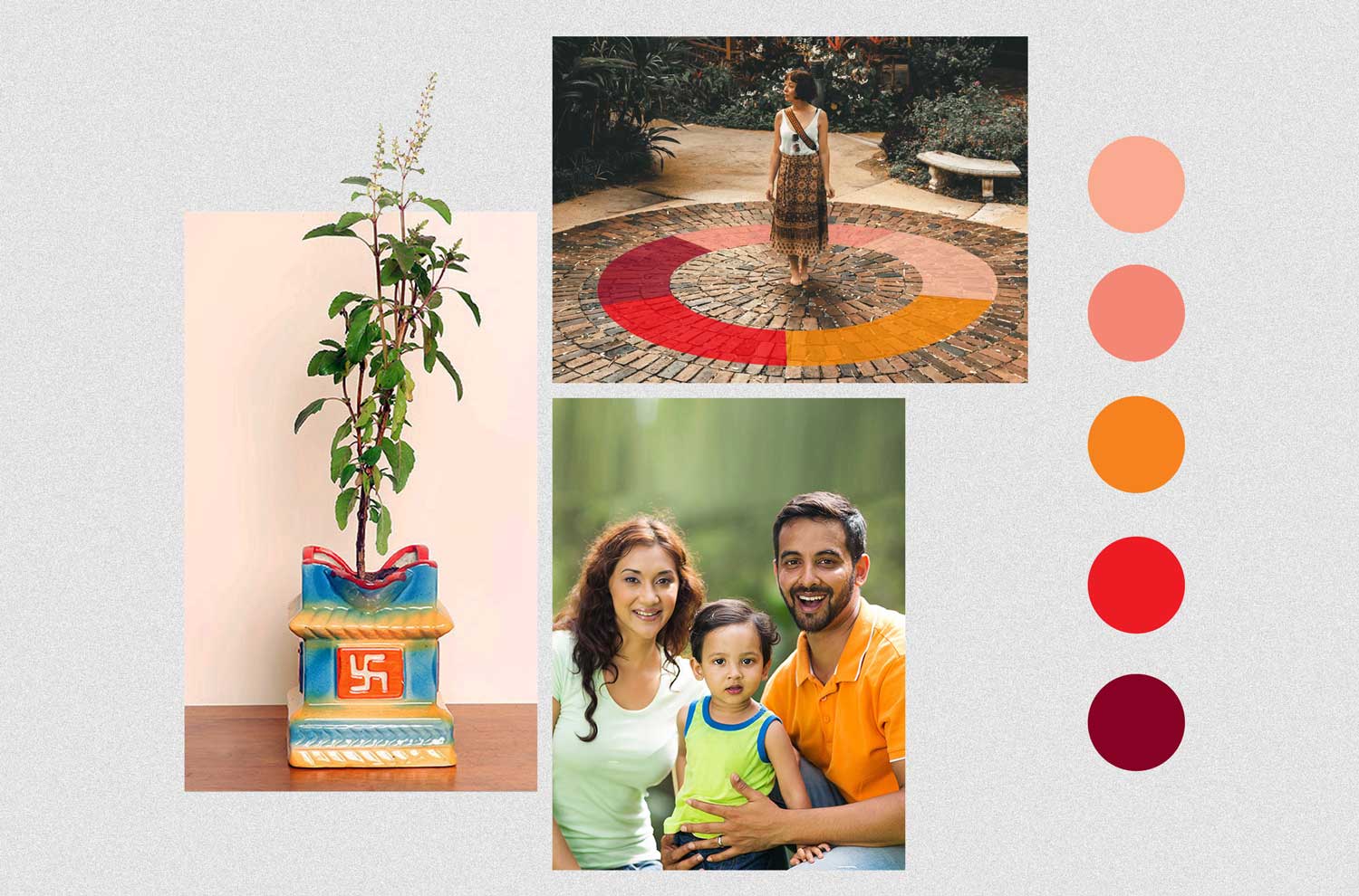
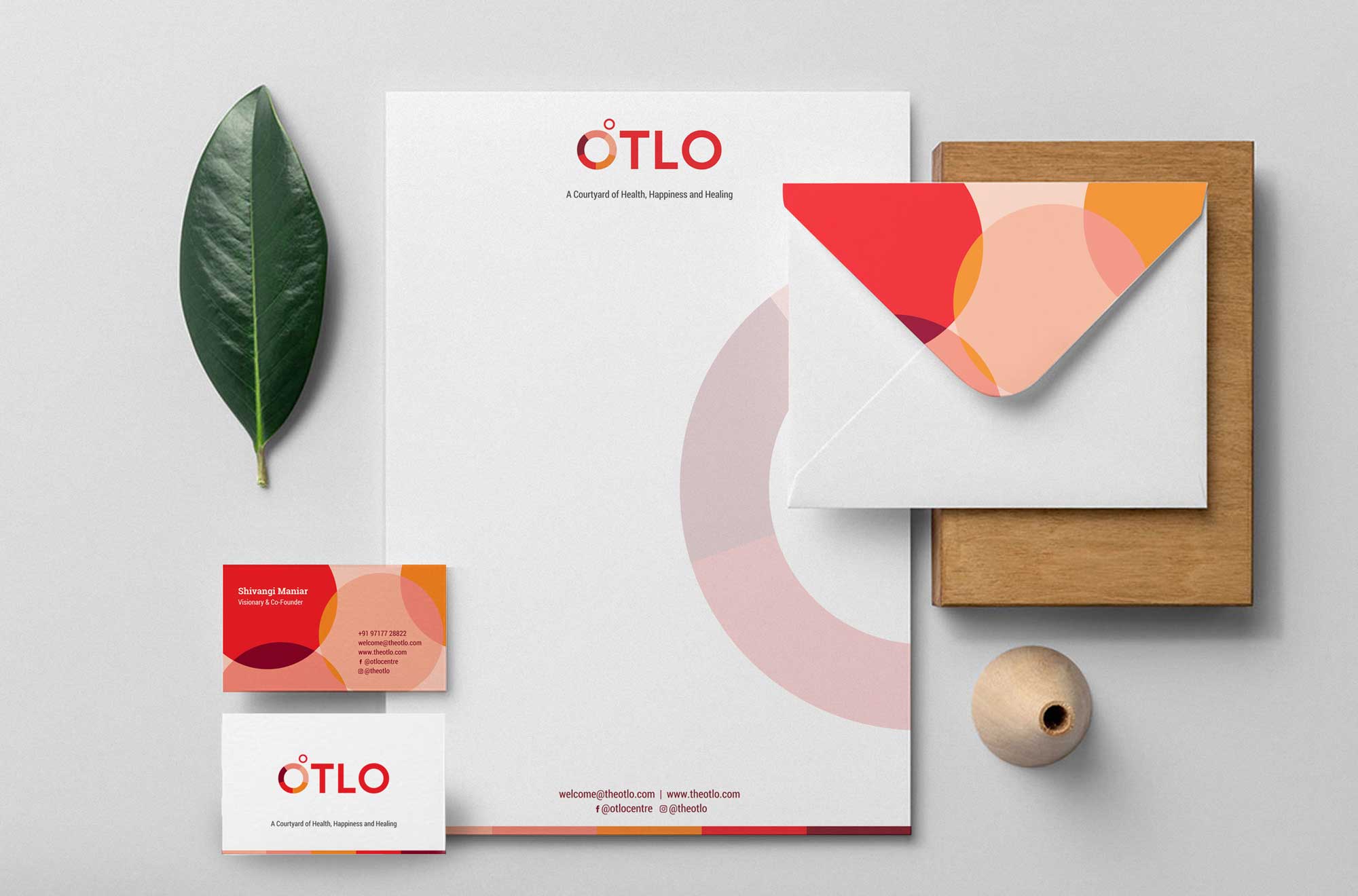
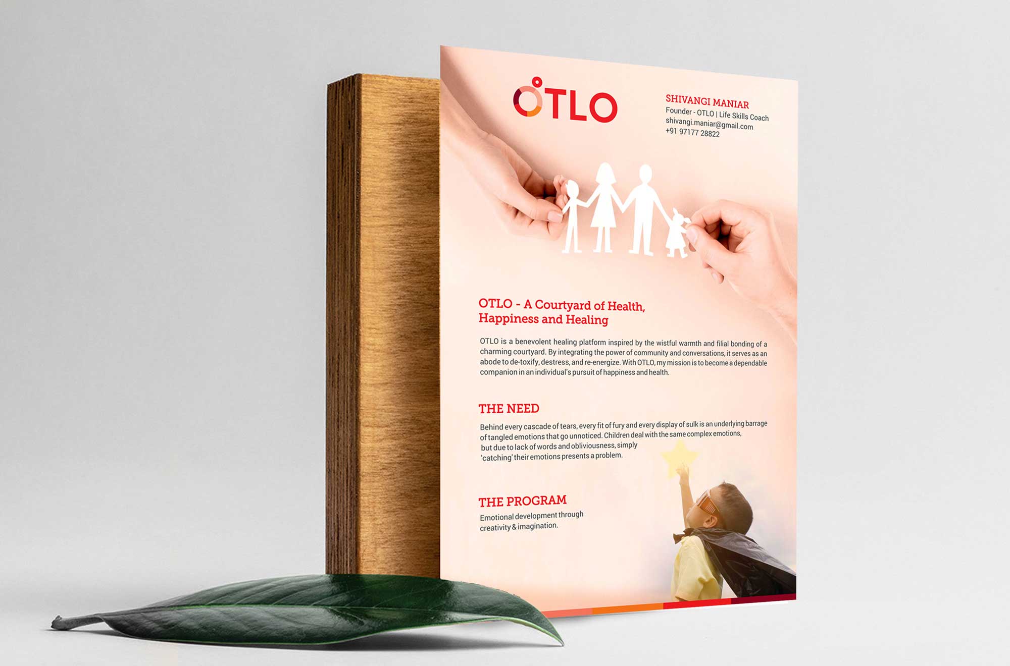
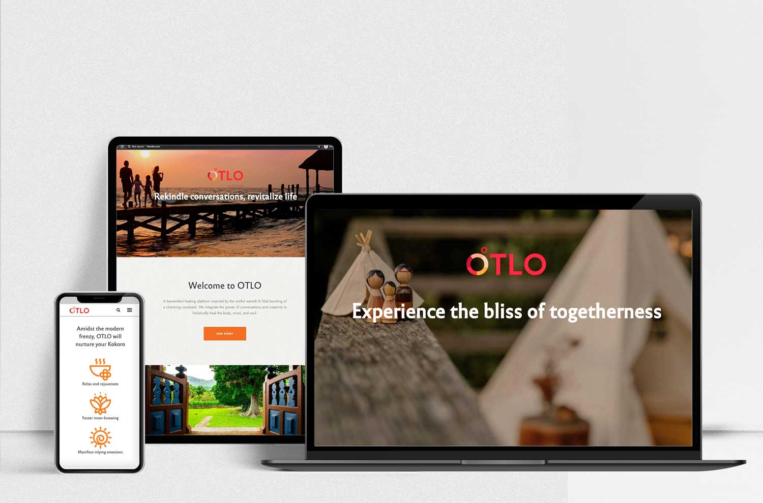
Our team blended diverse earthy shades while amalgamating evocative content with relatable imagery to communicate the brand’s personality and ‘the circle of essence’ to tell its idea in their brand collaterals like business stationery, founder’s profile and brand website.
While developing and designing the website, we incorporated vector iconography, visually appealing & readable fonts, in consonance with the brand’s ideology concept & visual language created in other aspects.
